2025 Watercolor Palette
I organize my palette into a chromatic area of strong, bright, mostly transparent colors, and an area of cave painting colors. I really like the Daniel Smith brand of paints. They have a very broad selection of intense, single pigment colors, so you know exactly what you’re getting.
Chromatic Palette
This isn’t so much of a split primary palette, or a tertiary palette as it is a collection of strong, bright colors I’ve learned to use together.
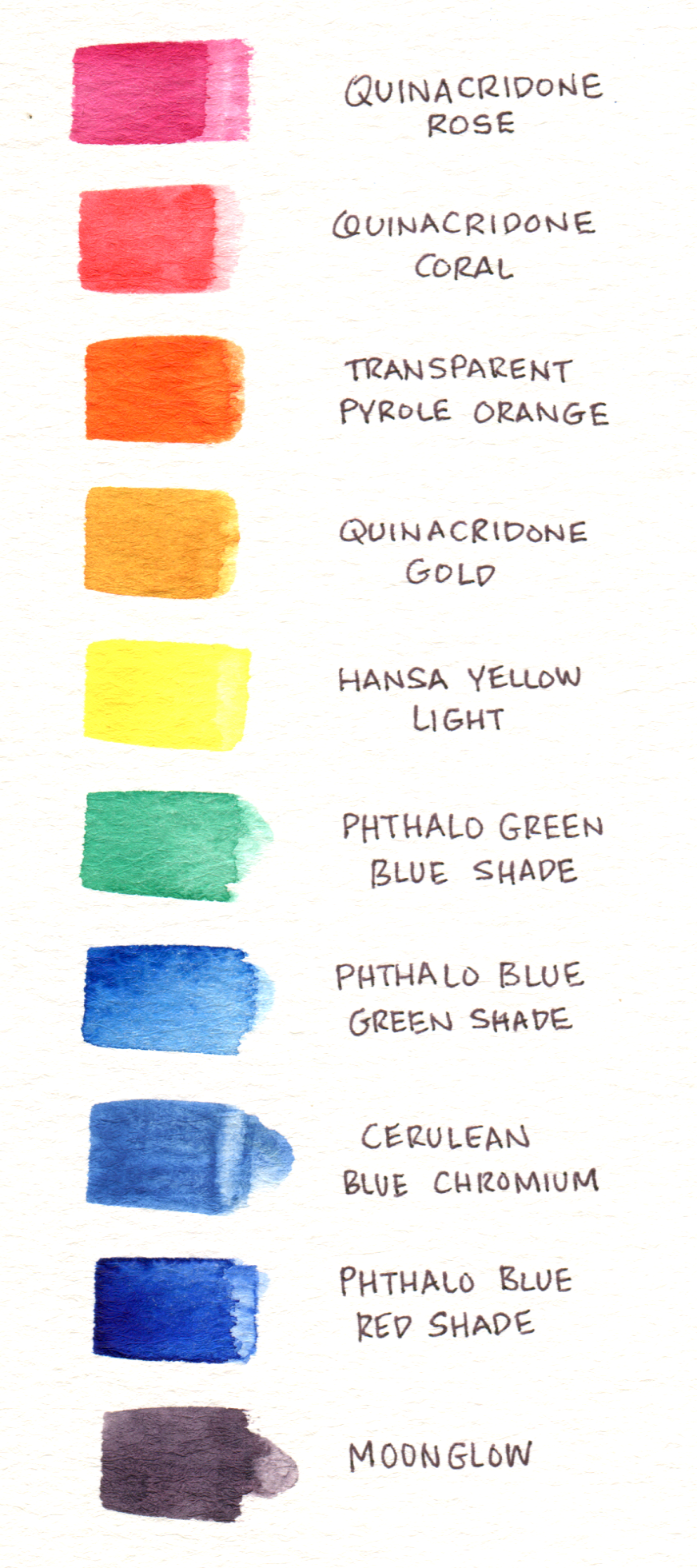
- Quinacridone Rose - Transparent warm magenta, great for mixing purples with warm blues, or caucasian flesh tones with Raw Sienna. Cool pink in a wash. Part of CMY triad.
- Quinacridone Coral - Transparent warm red. Warm pink in a wash. Quin. Rose and Coral are very important for their “pink in wash” behavior, most reds cannot do this.
- Transparent Pyrole Orange - Transparent red orange, great for mixing neutrals with blues, or bright oranges with yellows.
- Quinacridone Gold - Transparent warm gold, rich and deep in mass tone, bright in a wash. Great for mixing realistic neutralized greens.
- Hansa Yellow Light - Transparent slightly cool yellow. Not very strong on its own. Mix with Transparent Pyrole Orange for a middle yellow. Part of CMY triad.
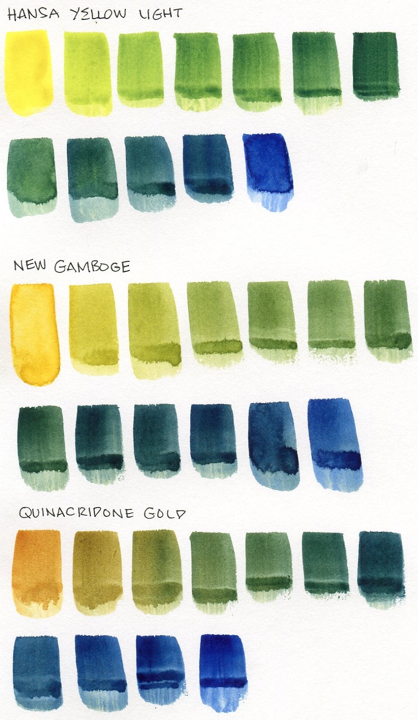
- Phthalo Green Blue Shade - Very strong, great mixer with yellow for clean greens, or Quinacridone Rose for blues, purples, and grays.
- Phthalo Blue Green Shade - Very strong, mixes bright greens. Part of CMY triad.
- Phthalo Blue Red Shade - Very strong, mixes great purples. I’ve replaced Ultramarine Blue with this blue this year. Neutralizes with Transparent Pyrole Orange.
- Moonglow - Neutralized purple I like to use in ink drawings. Similar mix of pigments found in Papermate felt tip pens.
In here, there’s the CMY palette of Phthalo Blue Green Shade, Quinacridone Rose, and Hansa Yellow Light. Quinacridone Gold, which isn’t a chromatic color, but it’s very bright in a wash, and it’s a great mixer. It looks like Quinacridone Coral and Transparent Pyrole Orange are a little too close together chromatically, but they provide very different washes, and it’s nearly impossible to mix a bright middle red from Quinacridone Rose and Transparent Pyrole Orange. You can mix a gred red that way, but it won’t be as bright as using Quinacridone Coral.
Why are there so many phthalos? I’ve avoided using Phthalo Blue Red Shade, in favor of Ultramarine for years, because of Phthalo’s drying shift, but I’m over it. I want to use the sickly strong phthalos, they’re more fun in the moment. I also really enjoy Prussian Blue as a duller alternative to Phthalo Green Blue Shade. I don’t have a purple in this palette, because Quinacridone Rose makes such great purples with any warm blue. However, I have a Moonglow, which is an interesting violet neutral color that’s fun to use as a wash on ink drawings.
Grug Palette
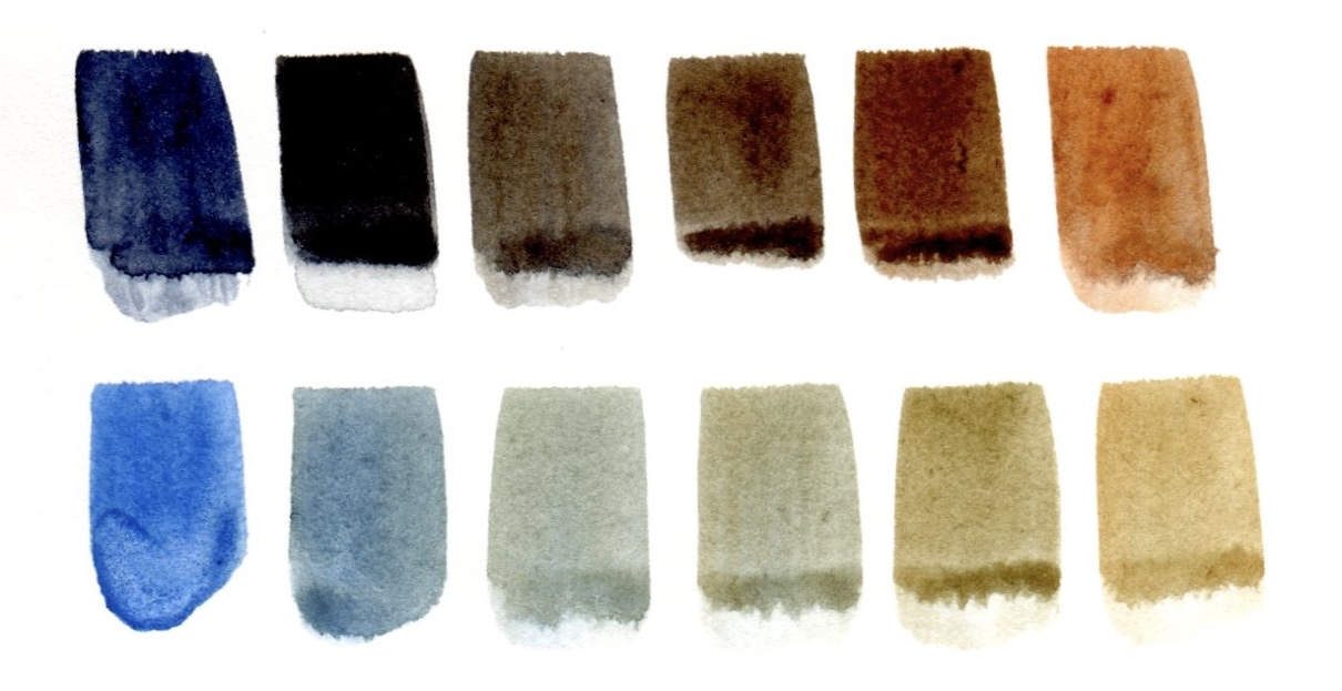
If I only had two colors, they would be Indigo and Transparent Red Oxide, these are my “Ultramarine and Burnt Sienna”, but lusher, darker, and stronger. I call these my cave painting colors, but they’re my favorite colors for quick sketches.
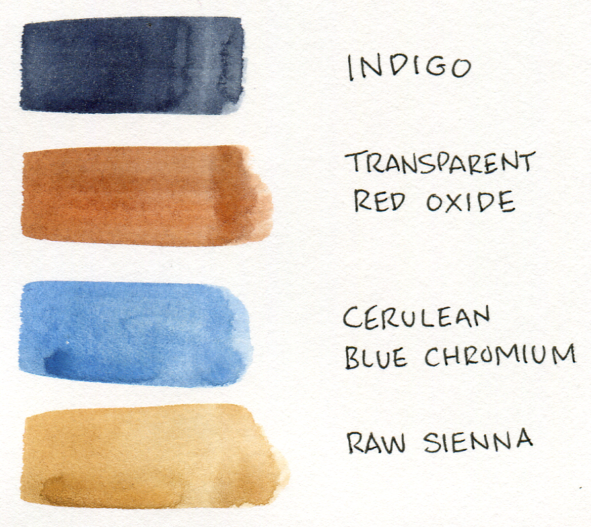
Indigo and Transparent Red Oxide, create a range from rich red orange brown, to chocolate, to walnut, to perfect black, to midnight navy. In a pinch, a very light wash of Transparent Red Oxide can pass for a skin tone for white folks. Cerulean Blue Chromium and Raw Sienna that neutralize to a nice midtone gray that can be pushed cooler towards blue, or warmer towards tan.
I like the Indigo more than Payne’s Gray or Netural Tint because it is so blue, and that gives you a lot of richness and chromatic space before you’re fully neutralized. I really enjoy the Transparent Red Oxide since it’s more fluid and redder than Burnt Sienna.